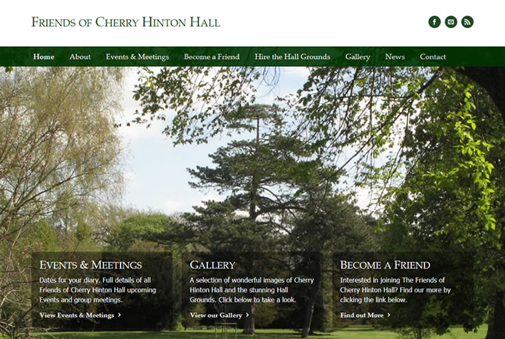
A single-page website is a cost-effective way of gaining a web presence for your business, service, organization or product quickly. This option is particularly attractive to start-up businesses where funds are limited until the business begins to develop cash flow. It’s also well suited to promoting a one-off event without going to the cost of a larger website.
Whilst a single page site can sometimes mean a large amount of content and more scrolling, a series of clever mechanisms using modern techniques can make it as user-friendly as a multi-page website. For example, navigation menus can link to particular areas of the page, such as a contact form. The user simply clicks the menu link in the usual way and the page scrolls to a pre-set point.
Pros:
- No page refresh when navigating the site
- Navigating through content is quicker than having to go to a new web page
- Site maintenance is easier with only one page to look after
- Google PageRank is applied to the entire website
- Distinction from other websites as single page websites are less common
- Ideally suited to Brochure sites that serve a single product
Of course, there are a few disadvantages to take into consideration here before making your choice.
Cons:
- Increased file size of the page
- Longer load times if you have a lot of content
- Possible design and layout limitations where there is a large range of varying content types required.
If you’re thinking of choosing the single page option for your website and need a little more help or advice please do feel free to drop me an email.
